Change Colours in a Bitmap Image using Browser CSS Filters
A high level look at working with different colour models
Last week we looked at how we can create greyscale versions of images in real time. Maybe we want to give our images a different flavour. Or maybe we might want to create engaging mouseover effects. In either case, we can use CSS to achieve our goal instead of having to potentially create and manage multiple versions of images.
Theming is another area we’ve looked at recently where we might need different versions of the same image – we might have multiple themes and want our icons to be a different colour in each. Well, it turns out we can use CSS to achieve this too. There are some caveats however, but to avoid this week’s newsletter from becoming too long, we’ll save those for another.
A (Very) High Level Exploration of Colour Theory
We can express colour in many ways. One common format in CSS is a hexadecimal code, e.g. #6495ed. Here, we use the first two characters (64) to specify the amount of red in the colour, the next two (95) for green, and the final two (ed) blue. In other words, we describe a colour by its intensities of pure red, green, and blue.
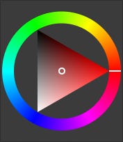
But we can model colour in other ways too. In some models, we reference the hue (base colour tone, e.g. orange, blue, etc.) directly. Image 1 shows the colour wheel from GIMP and gives us an idea of how this works. Looking at the outer ring, we can see we can specify any colour we need by referencing its degree of rotation; red is at 0, green at 120, and blue at 240. (Black, white, and the greys between are a special case and can be achieved via other parameters).
Hue Shifting
If we want an image in our app to have a different colour, one option is to use the CSS hue-rotate filter. By specifying a degree of rotation, we can work with these colour models, offsetting every colour in the image by the indicated amount.
As an example, Image 2 shows a blue arrow. Let’s say we wanted a red version of it. Looking at Image 1, we can see blue is at around the 7 o’clock position on the outer ring. We want it to be red, which is at the 3 o’clock position – one third of the way (120 degrees) anticlockwise around the ring. Based on this, we can apply a 120 degree hue rotation to it:
filter: hue-rotate(120deg)The result of this is shown in Image 3.
Bear in mind the degree of rotation offset refers to anticlockwise movements within the circle of hues in Image 1. Let’s say we wanted our original blue arrow to be green. Green is an additional one third of the way around the circle from red; a further 120 degrees makes the total offset 240 degrees. The following CSS would produce the results shown in Image 4.
filter: hue-rotate(240deg)Summary
You can use CSS to change colours within images in real time. This means you can have many versions of icon bitmaps without needing to manage multiple files.
Some colour models distribute the base colour tones across a circle spanning 360 degrees. With the hue-rotate CSS filter, you can work with these models to offset colours in an image by the amount specified. With careful usage, you can leverage this for areas such as theming – you’ll have different-coloured versions of icons, but without the hassle of maintaining separate files.
Bonus Developer Tip
If you’re looking for a command in the Edge browser but can’t remember where it is, you can use Ctrl+Q to search for it. You can use this to search for both features, and sites in your history.
These tips are exclusively for my Substack subscribers and readers, as a thank-you for being part of this journey. Some may be expanded into fuller articles in future, depending on their depth.
But you get to see them here, first.


